Friday, 26 October 2012
Photoshop - Curves and Levels Photograph
CD Cover - Photoshop
I have created my own CD cover in Photoshop. First I added the name of the
song - Old School - and the name of the group - Nature's Hero's. I chose a font
that was already on Photoshop rather than downloading my own, I chose to do
this because I think it suits the name of the group and the name of the song. I
made it green simply because the group is called 'Nature's' Hero's and the
colour green is associated with nature. I added the stroke effect and drop shadow
effect to the text; this makes it stand out more and adds energy to it because
if these effects were not added the text would just look plain and boring.
For the background I used the gradient tool in every corner and added 3 different brushes that I downloaded from www.brusheazy.com. To download these brushes I searched the website until I found one that I wanted to use then I clicked on it, then clicked download, then I clicked on the file in the folder and chose to extract it and then I saved it in my brushes folder that I created. After this process I had to load it on Photoshop so I could use it; to do this I had to click on the Brush tool on Photoshop, then at the top of the program there was a drop down menu for the brush tool, I clicked this then on the drop down menu there was another drop down menu which I then clicked on, from this menu I clicked on load brushes and chose the brushes I had downloaded and from this I could use them on Photoshop. Once I had all the brushes I downloaded in Photoshop I freely used them trying to create something I found appealing; I think the cover I have created looks like tie-dye which I think looks good.
For the background I used the gradient tool in every corner and added 3 different brushes that I downloaded from www.brusheazy.com. To download these brushes I searched the website until I found one that I wanted to use then I clicked on it, then clicked download, then I clicked on the file in the folder and chose to extract it and then I saved it in my brushes folder that I created. After this process I had to load it on Photoshop so I could use it; to do this I had to click on the Brush tool on Photoshop, then at the top of the program there was a drop down menu for the brush tool, I clicked this then on the drop down menu there was another drop down menu which I then clicked on, from this menu I clicked on load brushes and chose the brushes I had downloaded and from this I could use them on Photoshop. Once I had all the brushes I downloaded in Photoshop I freely used them trying to create something I found appealing; I think the cover I have created looks like tie-dye which I think looks good.
Friday, 19 October 2012
Photoshop Basics
This photograph has been vignetted this is where the outer edges are darkened to make the viewers eyes drawn to the centre. I have also used the dodge and burn tools; the dodge tool lightens the area that you click on whereas the burn tool darkens the area you click on.
To make the photograph vignetted on Photoshop you have to first go to the Elliptical Marquee tool and cover most of the image, but before this you must change the feathering to between 60 and 90; this will make it look more transitioned rather than having a clear line where the circle has been drawn. Next you need to go to select > inverse, then image > adjustments > brightness/ contrast; from here to can alter the brightness and contrast to what you want.
This photograph has only been slightly changed; I have used auto-colour, this just automatically makes Photoshop adjust the colour in the photograph. The colour has been slightly darkened and been made slightly 'fuller'.
To use auto-colour you need to go to image > auto-colour. There is also different things you can use after clicking on image such as auto-contrast and auto-tone.
This photograph has simply been de-saturated, this is where all the colour is taken out of the photograph and it becomes black and white. I also adjusted the brightness and contrast to make parts darker and parts lighter to shows a clearer difference.
To de-saturate a photograph on Photoshop you need to go to image > adjustments > de-saturate. To alter the brightness and contrast you need to go to image > adjustments > brightness/ contrast.

Monday, 15 October 2012
Shutter Speed Photographs and Evaluation
Shutter speeds help determine the type of photograph the photographer
takes; it is simply the amount of light that is let in the camera when the
shutter is open that meets the sensor for a certain amount of time.
A fast shutter speed would be used for photographing fast
moving objects such as cars, water or people running. This is because the fast
shutter speed allows the camera to capture the sharpest photograph. There are
other uses for fast shutter speeds; for example if the photographer is panning
the camera with the subject in it, the photograph can be made to make the
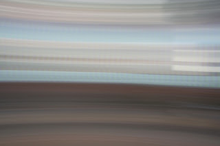
subject sharp but have the background blurred. Sometimes motion blur can
improve the photograph; it may make the photograph look like it has more
movement and energy. People will use a fast shutter speed because it makes the
photograph look like its subject is frozen and it is at its sharpest, also
there will be no camera shaking: it will look completely still. A slow shutter
speed would be used to capture something that may just quickly occur like a
lightning bolt, or as I used a torch, the camera is able to capture these types
of photographs because the shutter allows the light in for longer so the camera
will capture it all. A slow shutter speed similarly to a fast shutter speed can also lead to superb photographs. People will use a slow shutter speed because it will allow
them to create a photograph that is ‘in the moment’ like a lightning bolt, you wouldn't be able to capture that by using a fast shutter speed. Photographers
have to be careful when they are taking their photographs with a slow shutter
speed; they will most likely have to use a tripod, this will stop any concerns
over the camera shaking and will make the best photograph rather than the
camera being hand-held.
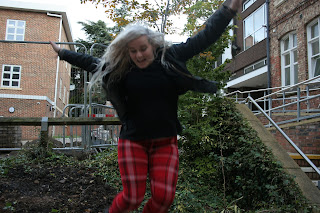
This photograph was also set to a fast shutter speed to make it in focus and sharp rather than blurred due to the fast movement of the subject. It is sharp; it has good lighting so I think the quality is good, with the exception of the framing. The framing is poor and lets this photograph down because one hand is cut off along with the bottom of both legs; to stop this problem happening in the future I will check them more carefully as soon as I take them and if I need to re-take them I will, I will also take a lot more of the same shot so I have more to choose from and stand further away to allow everything in the frame.
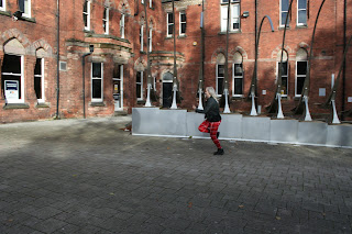
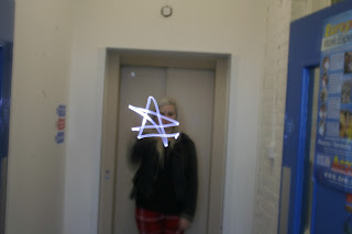
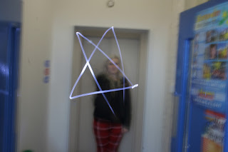
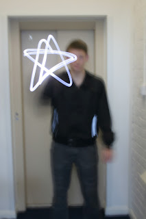
My overall targets are to make sure that the subject is fully in the frame if that is needed, to make sure the distance is correct to have everything in the frame but not be too far away, to remember to take lots of pictures just to make sure they will be correct and to check the lighting in each photograph and adjust the shutter speed if I need to and if I think it will improve the photograph.
Thursday, 4 October 2012
Composition Photographs Evaluation
This is a tilt shot, the camera is tilted upwards; I have learnt that this makes the subject look powerful, have authority over something. Yet this type of shot also can have bad effects such as if it was a close up shot, it wouldn't be appealing because the subjects nostrils may draw people's attention rather than what the photographs intentions were originally. This shot can sometimes be more about power than glamour. It is composed well because the subject is placed directly in the centre of the photograph therefore the viewer will be drawn there, and the subject looks like a powerful figure.
This is also a tilted shot but this time it is tilted down. I have learnt that this shot makes the subject become powerless, innocent and inferior. Sometimes this shot may be used to create sympathy or it could be used to make someone look small, this could mean that they are not as big and as smart as they think, or it could be a situation where the subject was on top of the world but then lost everything and became this person; if this was the case then this photograph would show their feelings which may be devastation, anguish or regret. It is composed well because the meaning that this photograph is supposed to have is clear; the subject does look small and powerless.
This shot has been taken off centre; the effect of this shot is that the subject may not be the most important part of the photograph and could be there to create effect or to give another meaning to something else in the photograph. It is composed well because the figure is in the left third of the photograph and may make some viewers think about why this has been done which will give photographs like this more meaning and recognition.
This photograph has been taken to make the subject's eye-line low; similar to the low-tilt shot. It usually means that the subject is powerless, innocent and inferior. Sometimes it could be because there is something else in the photograph which is more important; this could strengthen the meaning that the subject is powerless, innocent and inferior. This photograph is composed well because the subject looks lonely, depressed and inferior which is the meaning that this shot is supposed to have.
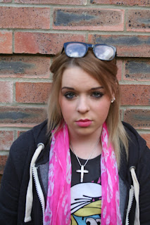
This is a close up shot; this type of shot is usually intended to show facial expressions or even to try to make people think about what the subject is thinking or feeling at a certain time. It is a shot type that people will see a lot; this is because it enables the photographs to connote or denote different things. It is composed well because the subject is looking straight into the camera lens; this will make viewers have different opinions of what she is thinking about or is feeling. It also is in sharp focus which allows the viewer to see specific facial expressions.
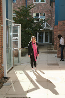
This photograph has been taken with a focal point, the focal point is usually taken in photographs with something leading to it which is usually a diagonal line; such as in the photograph the shadow is leading up to the focal point which is the person. The diagonal lines also add energy to the photograph because they are making the viewer look along or up or down the photograph waiting for something at the end. This photograph is not composed well; this is because there is more than one shadow. Therefore the energy is taken out of this photograph because the viewer will not be initially drawn to the subject's shadow and will have a slower reaction when they are first looking at the it.
All of the images are in focus and I used the focus ring to do this, this is mainly so that the photographs looked clear. I did not zoom in on any of the photographs because this may have made them become out of focus and I would have had to adjust the focus ring. Another reason for not zooming in would be because it may take the meaning of the photograph away. For example if I zoomed in on the first photograph and only showed the shoulders upwards and not the subject's body; it may have made them look less powerful and have less authority.
I think the strengths of my photographs are that they are all in focus and all of them apart from the last one are composed well. Another would be that the meaning that is supposed to be given in them is given apart from the last one.I think the only weakness of my photographs is that the last one is not composed well and as a result of this the purpose isn't clear and it takes the energy out of it.
This is also a tilted shot but this time it is tilted down. I have learnt that this shot makes the subject become powerless, innocent and inferior. Sometimes this shot may be used to create sympathy or it could be used to make someone look small, this could mean that they are not as big and as smart as they think, or it could be a situation where the subject was on top of the world but then lost everything and became this person; if this was the case then this photograph would show their feelings which may be devastation, anguish or regret. It is composed well because the meaning that this photograph is supposed to have is clear; the subject does look small and powerless.
This shot has been taken off centre; the effect of this shot is that the subject may not be the most important part of the photograph and could be there to create effect or to give another meaning to something else in the photograph. It is composed well because the figure is in the left third of the photograph and may make some viewers think about why this has been done which will give photographs like this more meaning and recognition.
This photograph has been taken to make the subject's eye-line low; similar to the low-tilt shot. It usually means that the subject is powerless, innocent and inferior. Sometimes it could be because there is something else in the photograph which is more important; this could strengthen the meaning that the subject is powerless, innocent and inferior. This photograph is composed well because the subject looks lonely, depressed and inferior which is the meaning that this shot is supposed to have.
This is a close up shot; this type of shot is usually intended to show facial expressions or even to try to make people think about what the subject is thinking or feeling at a certain time. It is a shot type that people will see a lot; this is because it enables the photographs to connote or denote different things. It is composed well because the subject is looking straight into the camera lens; this will make viewers have different opinions of what she is thinking about or is feeling. It also is in sharp focus which allows the viewer to see specific facial expressions.

This photograph has been taken with a focal point, the focal point is usually taken in photographs with something leading to it which is usually a diagonal line; such as in the photograph the shadow is leading up to the focal point which is the person. The diagonal lines also add energy to the photograph because they are making the viewer look along or up or down the photograph waiting for something at the end. This photograph is not composed well; this is because there is more than one shadow. Therefore the energy is taken out of this photograph because the viewer will not be initially drawn to the subject's shadow and will have a slower reaction when they are first looking at the it.
All of the images are in focus and I used the focus ring to do this, this is mainly so that the photographs looked clear. I did not zoom in on any of the photographs because this may have made them become out of focus and I would have had to adjust the focus ring. Another reason for not zooming in would be because it may take the meaning of the photograph away. For example if I zoomed in on the first photograph and only showed the shoulders upwards and not the subject's body; it may have made them look less powerful and have less authority.
I think the strengths of my photographs are that they are all in focus and all of them apart from the last one are composed well. Another would be that the meaning that is supposed to be given in them is given apart from the last one.I think the only weakness of my photographs is that the last one is not composed well and as a result of this the purpose isn't clear and it takes the energy out of it.
Subscribe to:
Comments (Atom)


